Step into a calmer kind of style clarity
Color Season: Why Do Some Colors Make You Look Tired?
Color Season: Why Do Some Colors Make You Look Tired?
If you've ever looked "fine" in one mirror and exhausted in another, this is a gentler way to figure out what actually flatters you, at your pace.
What is my color season?
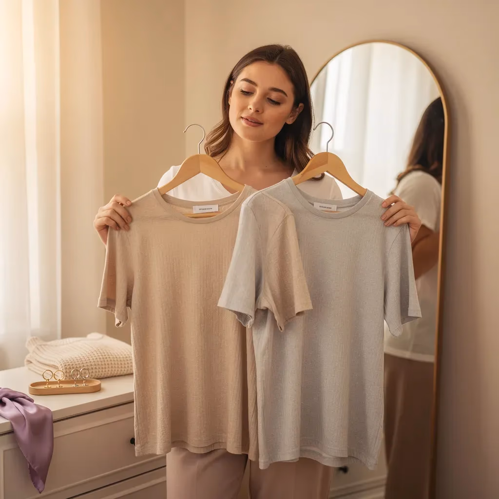
That moment when you try on a color you want to love... and your face does that thing where you suddenly look a little gray, a little tired, like you didn't sleep. Of course you start second-guessing yourself. Of course your brain goes, "Is it my skin? My makeup? The lighting? Am I imagining this?"
You're not imagining it. You're noticing harmony.
When you search "what is my color season", you're really asking: "Which colors look like they belong with me, instead of sitting on top of me?" A color season isn't a rulebook. It's a filter. It takes style from "guessing game" to "quietly obvious."
This is also why "what is my color analysis" can feel so emotional. It's not about "being picky." It's about the relief of finally understanding why the same shade can make one friend glow and make you look washed out.
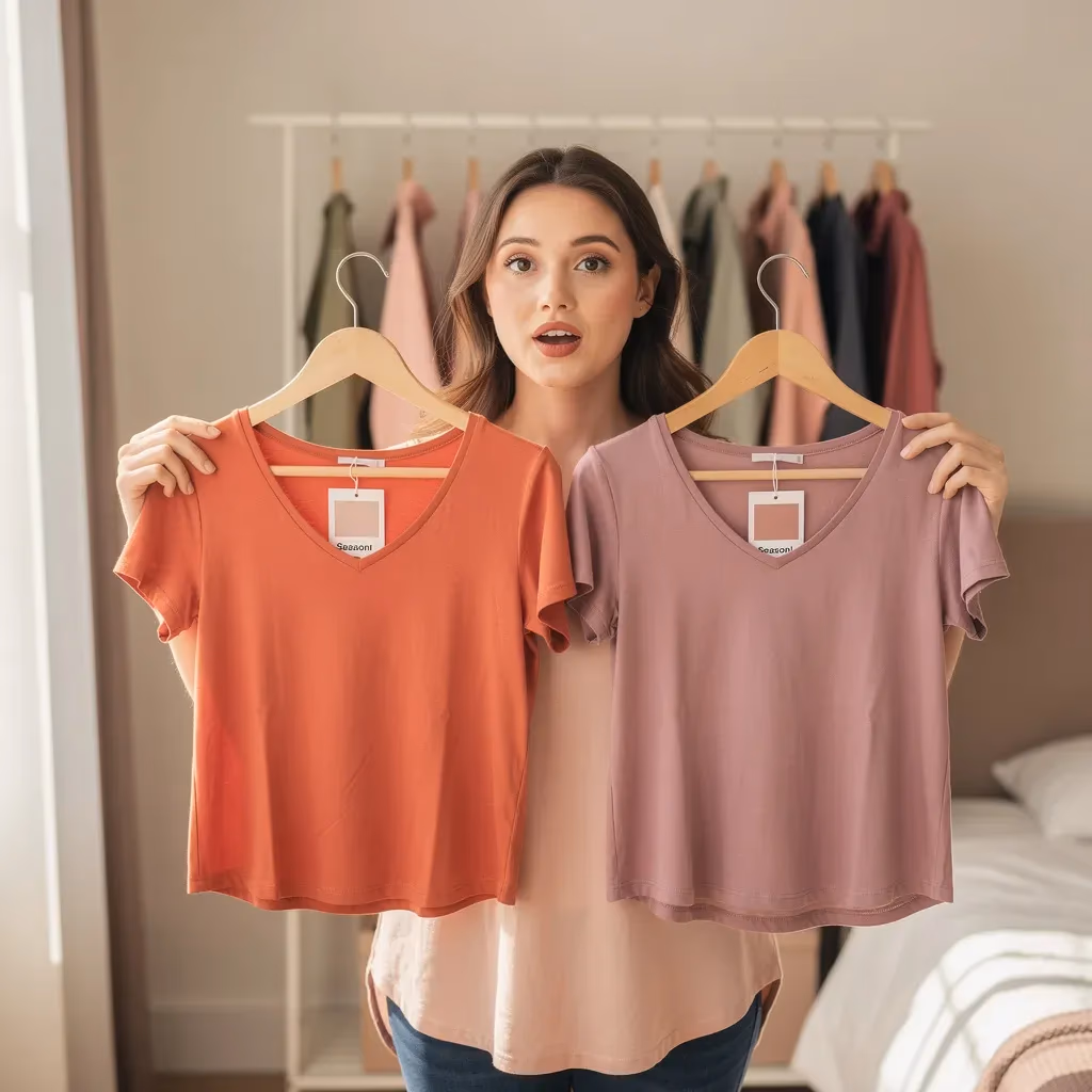
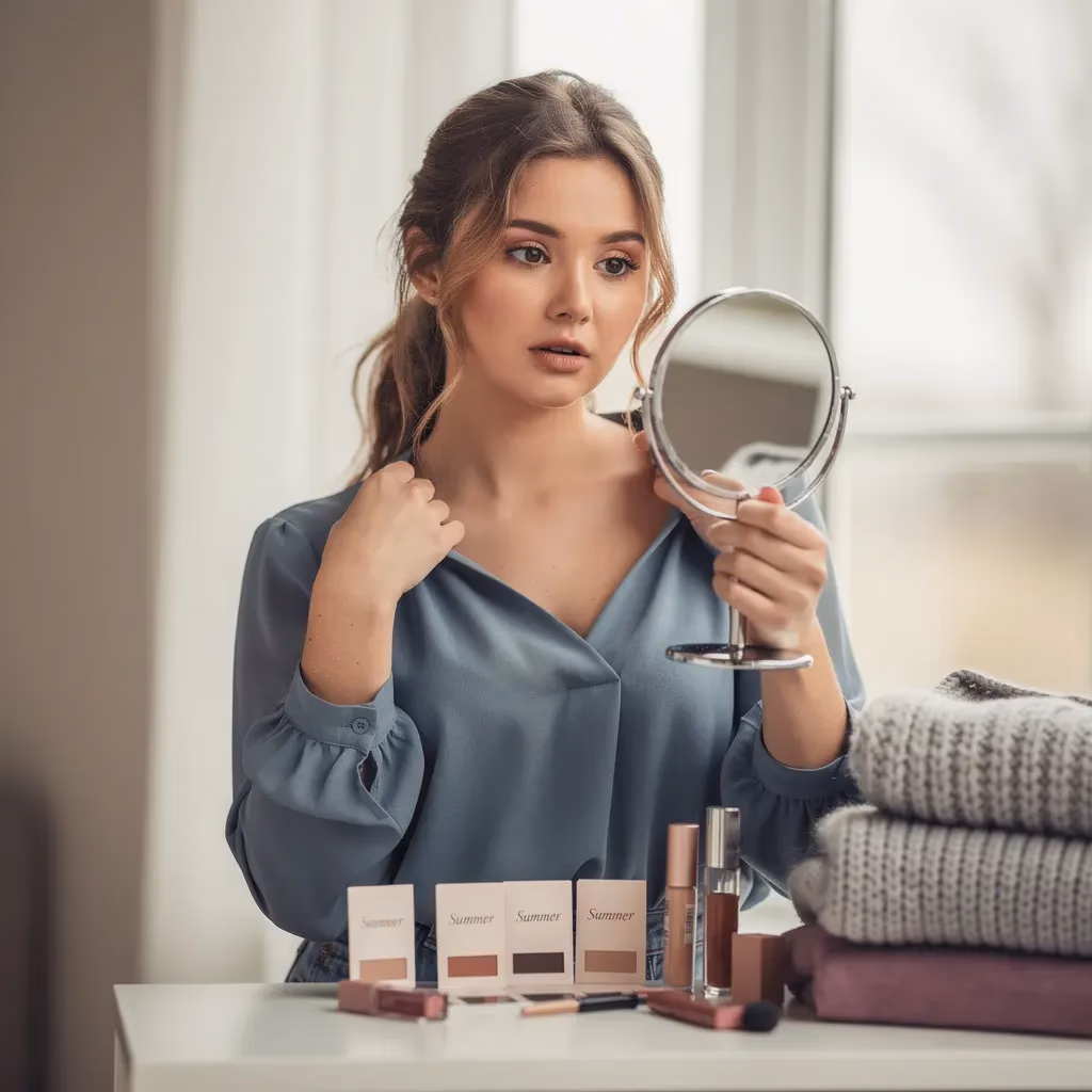
This Color Season quiz free version is built to answer the practical question you keep asking: "what is my seasonal color palette"... in the real world. Not just theory. We use the signals that show up in your actual life:
- Jewelry: whether gold or silver blends better
- Whites: whether cream or optic white looks cleaner on you
- Makeup: whether peachy tones or rosy tones look more seamless
- Photos: whether certain colors make you look tired or oddly gray
- Daily life: whether you want a palette that reads polished at work, or relaxed on weekends
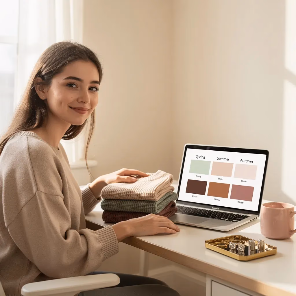
Your result will land in one of the four seasons:
Spring
- Definition: Warm, light, and clear colors that make you look fresh and awake.
- Key traits:
- Golden warmth reads seamless on you
- Lightness feels natural (not washed out)
- Clear colors look crisp, not loud
- Benefit: Your palette gives you that "I slept" look even on 5 hours.
Summer
- Definition: Cool, light, and soft colors that make you look smooth, calm, and naturally polished.
- Key traits:
- Silvery coolness harmonizes with you
- Gentle light colors feel balanced
- Soft, muted shades look refined (not dull)
- Benefit: You stop overcompensating with makeup because your colors do the work.
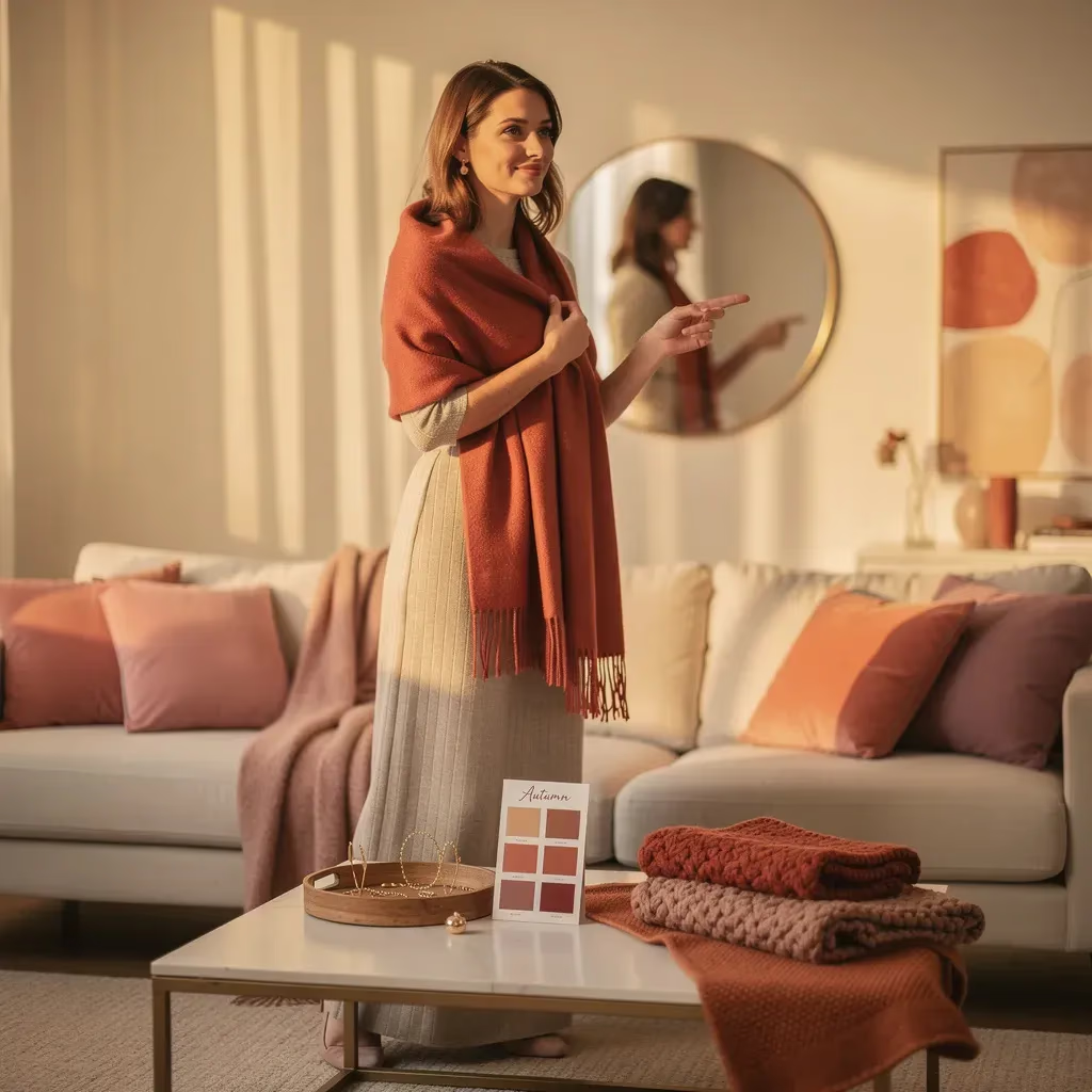
Autumn
- Definition: Warm, deeper, and softly rich colors that make you look grounded, glowy, and quietly luxe.
- Key traits:
- Warmth looks cozy and expensive on you
- Richer depth feels steady, not heavy
- Soft saturation looks elegant, not faded
- Benefit: You get permission to stop chasing icy trends that never felt right.
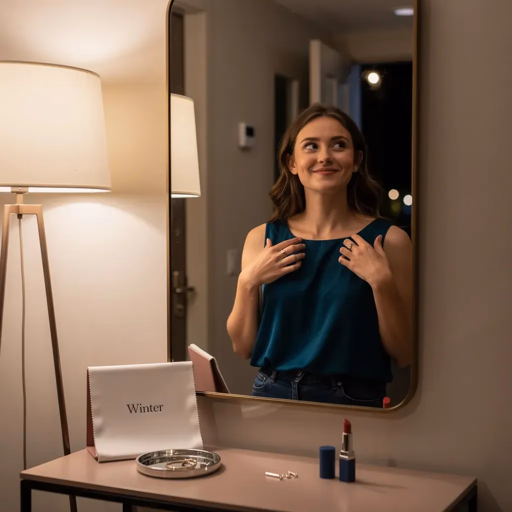
Winter
- Definition: Cool, deep, and clear colors that make you look defined, bright, and striking.
- Key traits:
- Cool tones look clean and intentional
- Depth gives you structure and edge
- Clear color pops in a sleek way
- Benefit: You look "done" even when your outfit is simple.
If you're also wondering "how to do color analysis", this quiz gives you a calm way to do it without turning your bathroom mirror into a courtroom. It doesn't rely on one clue. It stacks multiple proofs, so your result feels stable.
And yes, if what you're searching is "what is my color season quiz", you're in the right place. This is built for the exact "I need clarity" feeling behind that search. If you keep searching "what is my color season quiz" because every method feels shaky, you're exactly who this was made for.
5 ways knowing your color season makes style feel lighter (and a little more "you")
💡 Understand why "what is my color analysis" has felt confusing, then watch it get simple in minutes.
🛍️ Shop with a real filter, so "what is my seasonal color palette" isn't a mystery when you're standing under harsh store lights.
📸 Choose shades that hold up in photos, which is a huge reason people keep searching "how to do color analysis" in the first place.
💄 Pick makeup tones that blend into your face, so your lipstick stops looking like it belongs to someone else.
✨ Build a closet where outfits match each other, so mornings stop feeling like an exam.
Chelsea's Story: The Day My Closet Stopped Feeling Like a Trap
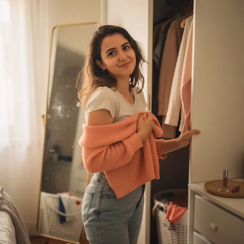
The first time I noticed it, it was so small it almost felt stupid to care about: I put on a shirt I actually liked, looked in the mirror, and immediately changed it. Not because it was ugly. Because it felt... loud. Like I was about to get perceived too hard.
I'm 31, and I work as an event planner, which is funny, because I can coordinate twelve moving parts and still forget that I own, like, a normal amount of clothing. My calendar is color-coded. My inbox is a crime scene. My closet is a different kind of chaos, the kind that looks fine until you have somewhere to be and suddenly nothing feels right on your skin.
And lately, every outfit decision had turned into a weird little emotional exam I couldn't pass.
It wasn't that I didn't have clothes. I had plenty. It was that getting dressed felt like picking a version of myself and praying nobody disagreed with it. Some mornings I'd stand there holding two tops, hearing two imaginary voices in my head: one saying, "Try. Look put together. Be impressive." The other saying, "Don't try too hard. Don't look like you're asking for attention."
If I wore something brighter, I'd spend the whole day bracing for someone to say, "Oh, you're so dressed up." If I wore something muted, I'd still spend the day quietly wondering if I looked washed out and tired. Either way, I was scanning faces. Reading tone. Doing that thing where you laugh a little too quickly just to prove you're not insecure, even though you absolutely are.
I started defaulting to black. Not chic black, not intentional black. More like emotional support black.
It got especially bad whenever I had an event with photos. Not even fancy ones, just the kind where someone's phone comes out and suddenly you're watching yourself get captured from angles you didn't agree to. I'd pick an outfit, walk out the door, and feel this tight, buzzy energy under my ribs the whole drive. Like I'd forgotten something important, except the thing I'd "forgotten" was a guarantee that I wouldn't look wrong.
And I didn't know how to explain that to anybody without sounding shallow. Like, no, I'm not having a breakdown over a shirt. I'm having a breakdown over the way my brain thinks my shirt is going to decide whether I get to feel safe in my own body today.
My friend Paige is the kind of friend who doesn't let me hide behind jokes when she knows I'm spiraling. We were getting coffee after I complained, for the third time that week, that I had "nothing to wear" even though I'd ordered two packages online in the last month. She didn't roll her eyes. She didn't say I was being dramatic. She just looked at me and said, "Are you actually stressed about clothes? Or are you stressed about being seen?"
I laughed because it hit too close. Then I did what I always do. I downplayed it. "It's not that deep."
But it was that deep. It was deep in the annoying way where it's always there, quietly directing your choices.
When my friends would text "Outfit check?" before a night out, I'd send a mirror selfie and then watch my phone like it was a heart monitor. I wasn't even looking for compliments exactly. I was looking for proof I wasn't about to embarrass myself. Proof I wasn't "too much" or "trying" or doing the thing where I accidentally make people uncomfortable by existing too brightly.
Sometimes I'd take the photo, stare at it, delete it, retake it, change the angle, change the lighting, change the shirt. I'd end up sending something safe because safe had a higher chance of getting a quick, easy "cute!" response. And if the response took too long, I'd do the whole thing where I convince myself it means something. That they're busy, sure. But also maybe they hate it. Maybe they hate me. Maybe they think I'm ridiculous for asking.
It sounds extreme when I write it out like this. But in the moment it felt normal. It felt like the price of admission to being around people: try not to make them uncomfortable. Try not to stand out in a way they'll punish later. Try not to give them a reason to look closer.
And the thing is, I don't even think my friends were the problem. They were sweet. They always answered. I was the one making it a test. I was the one making it mean "Am I okay?" instead of "Does this top look fine?"
Some mornings I'd open my closet and feel this weird flash of resentment toward my own clothes. Like they were refusing to cooperate. Like they were all tiny versions of me that I kept failing to manage. I'd get dressed, change, get dressed again, and end up leaving the house already tired.
At some point, I had to admit this wasn't really about my closet. It was about my brain turning everything into a social risk assessment, including a sweater.
I found the quiz after reading this self-help essay that was supposedly about "confidence," but it described that specific, private kind of exhaustion: the constant effort of anticipating how you'll land in other people's eyes. I was sitting on my bed with my laptop, halfway through folding laundry, and I clicked a link that said, "Style Palette: What's My Color Season?" mostly because it felt harmless. Like it would be fun. Like it would not read my soul.
I was wrong about the "harmless" part.
It asked about hair and eyes and skin, sure. But it also asked about what colors made me feel more awake, more softened, more harsh. The questions were so specific that I caught myself getting defensive, like, why is this quiz allowed to know this much about my face?
I didn't even have good photos for half the questions, so I ended up in my bathroom with the overhead light off, using window light like I was conducting a tiny, extremely low-budget science experiment. I held up different shirts, scarves, even an old pillowcase, and watched what happened to my skin. I kept thinking, this is ridiculous. Then I'd see something shift, like my face suddenly looked clearer, and I'd go quiet. Because it wasn't ridiculous. It was real.
When the result came up, I stared at it longer than I meant to.
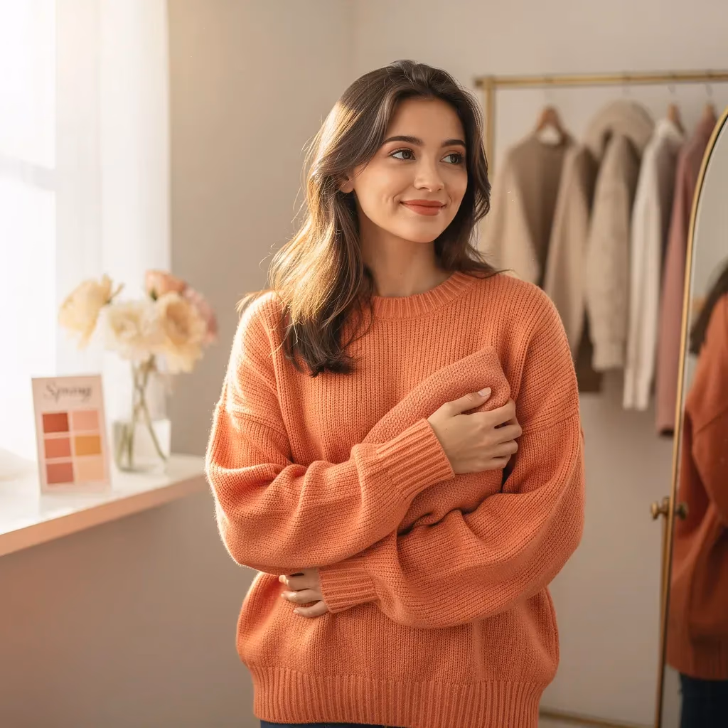
It gave me a season, one of the four: Spring, Summer, Autumn, or Winter. Mine was Spring. And in normal words, it basically meant: warm, clear, lively colors make me look more like myself. Not more "done." More like my face is already doing the work and the clothes are finally cooperating.
It said the best colors for me were things like coral, peach, warm pink, clear turquoise, fresh greens, creamy neutrals. It also gently dragged me by explaining why I kept reaching for certain shades that technically "matched everything" but made me look kind of flat. It wasn't insulting. It was... clarifying.
I felt this weird rush of relief, like my closet had been a room I couldn't find the light switch for, and someone finally just pointed to the wall and went, "It's right there."
I screenshotted the palette like it was a boarding pass.
Then I did something I didn't expect. I opened my closet again, but this time like I was looking at it through different eyes. I wasn't thinking, "What will people approve of?" I was thinking, "What will actually match me?" Such a small difference, and it hit me like a wave. I have spent years trying to dress for an imaginary jury. No wonder I was exhausted.
The shift didn't happen in a dramatic montage where I magically became a stylish person who breezes through mornings. It was messier than that.
I started with one tiny experiment: I wore a soft coral top to a site visit. Not neon. Not attention-grabbing. Just... warm. And I spent the first hour waiting for the familiar self-consciousness to hit. The "Is this too bright?" alarm. The "Are people staring?" paranoia.
It didn't hit the way it usually did.
Instead, my coworker Michelle looked at me and said, "You look really awake today. Cute top." Then she kept talking about table linens like it was the most normal thing in the world.
I remember standing there with my clipboard thinking, oh. So the world isn't actually waiting to punish me for wearing a color.
But I still did the old thing in my head afterward, because of course I did. I replayed her tone. I tried to figure out if she meant it or if she was just being polite. I tried to decide if I looked "awake" because the color was right, or because I'd slept better, or because I was imagining the whole thing.
That was when I caught myself. It wasn't about the compliment. It was about the safety I kept trying to extract from other people. I wanted someone to tell me I was okay, and I'd accept it for ten minutes, then I'd need it again.
Over the next few weeks, I started doing this thing where I'd pick one Spring color and build around it like a crutch. Cream pants plus a peachy blouse. A warm green tee under a denim jacket. Gold hoops instead of silver, which felt weirdly intimate, like choosing to agree with my own skin tone.
I even changed my makeup a little, not in a "new me" way, but in a "why do I keep buying cool-toned lipstick that makes my mouth look kind of gray?" way. I swapped it for a warmer tint and it was so subtle that nobody would notice, but I noticed. My face looked less like it was fighting itself.
And I stopped buying things "because they look good on other people." I stopped holding a cardigan in a dusty gray and trying to convince myself it was timeless and practical when, on my body, it made me look like I hadn't slept in days. That was a hard one, because I love "practical." Practical has always felt like approval.
There was this one Saturday where I did a mini closet clean-out, and it was more emotional than it needed to be. Not because I was attached to the clothes. Because I was attached to what I thought the clothes said about me. The cool-toned blazer that made me look serious. The muted mauve sweater that looked sophisticated in the store lighting. The charcoal dress I bought because black felt like the only safe answer in the world.
Holding them, I could feel the old fear: if I let these go, what if I'm wrong about the Spring thing? What if I pick the wrong colors and people notice? What if they think I'm trying too hard?
Then I had this quiet thought: it's okay if I get it wrong sometimes. It's clothes, not a moral decision. That sounds obvious. It did not feel obvious in my body. It felt like permission I hadn't known I was allowed to have.
Paige came over later and I showed her my screenshots like I was presenting evidence in court. She squinted at the palette, then looked at my face, and she said, "Honestly, yeah. This makes sense. You always look really good in those warm colors and you never wear them."
"Because I'm scared," I admitted, and it came out so plain it surprised me.
She didn't make a big deal out of it. She just nodded like it was normal. Like it was human. Like it wasn't embarrassing to say.
A month after that, I had a friend's birthday dinner. The kind where everyone takes pictures, and later you either feel cute about it or you spiral into a shame nap. I put on a dress in a warm turquoise, and for ten minutes I kept hovering by the mirror like a moth. My brain tried to do its usual routine: "This is a lot. This is attention. People will think you're trying to be the main character."
I didn't change. Mostly because I was running late, but still.
At dinner, nobody acted weird. Nobody made a comment that made my stomach drop. The photos happened. And when I looked at them later, I didn't zoom in and hate myself. I just looked... present. Like I was actually there, not hiding behind a safe color and a polite smile.
And I know that sounds like such a small win. But for me, that was huge. Because photos used to feel like punishment. Like proof. Proof that I should have tried harder, or tried less, or done something different, or somehow been more acceptable.
It wasn't that I became a different person. I just stopped fighting my own coloring like it was a personality flaw.
It also did something unexpected to my relationships, even the casual ones. When I felt better in my clothes, I didn't cling as hard to other people's reactions. I wasn't as desperate for the "You look cute!" text to calm me down. I could still want it, sure, but it didn't feel like oxygen.
I started sending outfit photos without rewriting the caption three times. I stopped doing the thing where I pre-apologized, like "Ignore the mess lol" or "This is dumb but..." before I even gave someone a chance to respond. Sometimes I still did it. Old habits. But I noticed it now, which was new.
At work, I noticed I took up a little more space. Not in a loud way. In a quiet way. Like I wasn't trying to disappear into neutral colors and hope nobody looked at me too long. I still cared how I came across, but it felt less like a life-or-death situation.
One afternoon, we were setting up a venue and the lighting was awful, that yellowish overhead that makes everyone look kind of sick. Normally that would have set me off, because if the lighting is unflattering, my brain immediately decides I must look unflattering. Instead, I caught a glimpse of myself in a glass door and I looked... fine. Better than fine. The warm green top I'd chosen didn't fight the light. It held its own. I had this tiny moment of gratitude toward my past self for picking something that wouldn't turn the day into a self-hatred marathon.
That change was subtle, but it mattered. My nervous system got one less reason to be on high alert.
Now, months later, my closet isn't perfect. I still have my safety-black days. I still sometimes buy something on sale and then realize, in the harsh light of my bathroom mirror, that it was never going to be a Spring moment for me. I still stand there some mornings and think, why is this so hard for me when other people just throw on a sweatshirt and go?
I still do that thing where I reread my own words before I hit send, even about stupid stuff like, "Running late, be there soon." Because some part of me is always trying to prevent the moment where someone decides I'm inconvenient.
But I have a language for it now. A map.
When I feel that old panic creep in, I can narrow it down. Is this a "I don't know what to wear" problem, or is this a "I'm scared of being seen" problem? Usually it's the second one wearing the mask of the first.
And it helps to have something concrete. "Spring" isn't a personality, but it gives me a place to stand. It gives me a handful of colors that feel like home. I can grab coral or cream or clear turquoise and feel my brain unclench a little, because I'm not guessing. I'm not bargaining with myself in the mirror. I'm not trying to be someone else's version of pretty.
I don't have it all figured out. I still care too much about what people think sometimes. I still check photos and hold my breath. But now, when I put on a color that actually matches my season, it feels like I get to exhale. Like I'm not auditioning. Like I'm just... showing up as myself, in the right light.
- Chelsea W.,
All about each color season type
| Color Season | Common names and phrases you might relate to |
|---|---|
| Spring | "Warm and bright", "clear and sunny", "fresh colors", "gold looks right", "peachy makeup always works" |
| Summer | "Cool and soft", "dusty pastels", "silvery", "muted looks elegant", "black feels too harsh" |
| Autumn | "Warm and rich", "earthy but polished", "golden glow", "cream over white", "texture and warmth" |
| Winter | "Cool and bold", "high contrast", "jewel tones", "optic white looks crisp", "black looks sleek" |
Am I a Spring?
You know that tiny rush when a color makes your whole face look clearer. Not in a fake way. More like you finally look like yourself again. If you've been quietly typing "what is my color season" while holding up tops in store lighting, Spring might be the answer that makes your shoulders drop.
Spring isn't "neon." It's not "little girl colors." It's warm, light, and clear. The vibe is fresh, clean, and awake. The kind of palette that makes you look polished without looking like you're trying to prove something.
If you're here because you searched "what is my color season quiz", I want you to know this: you're not failing style. You're trying to get a stable system. That's a very sane goal.
Spring Meaning
Core understanding
Spring means warm undertones and clearer colors tend to harmonize with your features. Gold jewelry often looks like it belongs. Warm makeup (peach, coral, warm nude) tends to blend in instead of sitting on top. When a Spring shade is right, you look more awake and even. It's a "my skin looks smoother" effect.
A lot of women with Spring coloring have this quiet history of second-guessing because they learned to play it safe. Maybe you bought muted neutrals because they felt "responsible" or "grown." Then you wondered why your face looked a little dull, especially in photos. That isn't you being dramatic. It's a mismatch. This is why the question "what is my color analysis" keeps coming back, even when your closet is full.
Your body signals are usually quick with Spring. It's the "ahh" in your chest when you put on a warm clear shade and you stop scanning for what's wrong. Your jaw unclenches. You look in the mirror and your eyes get sharper, like you can finally see you.
This is also where Spring gets misunderstood online. People try to answer "what is my color analysis" with one clue (veins, eye color, one lipstick). Real "how to do color analysis" is pattern recognition: metals, whites, makeup, photos, and that overall feeling of ease. If you've wondered "how to do color analysis" without spiraling, Spring is a good place to start because the right colors often look obviously right.
What Spring looks like
- Warmth that looks effortless: Golden-leaning colors make your face look smoother, not sallow. People might say "you look healthy" and you feel like, "I literally just changed my shirt."
- Clear colors wake you up: When a shade is clean (not dusty), your features look crisp. You might notice you look more "alive" even with messy hair and no makeup.
- Muted shades can make you disappear: Dusty, grayish tones can drain you. You might try to fix it with bronzer, blush, or more concealer, then still feel off.
- Soft whites usually win: Cream, warm off-white, and oyster tend to look harmonious. Optic white can sometimes feel a bit sharp or separate.
- Gold jewelry reads like a glow: Gold hoops or warm metal necklaces can look integrated. Silver can work, but it often feels cooler than you.
- Warm makeup blends fast: Peach blush, coral lips, warm nude liners tend to look seamless. Cooler rose tones can look cute but slightly disconnected.
- Light-to-medium depth feels balanced: Very dark colors can feel heavy or "costumey." Lighter shades feel like they match your natural brightness.
- Photos can be surprisingly honest: Spring-friendly colors keep your face looking awake in pictures. Cooler or dusty colors can quietly make you look tired.
- Compliments show up with freshness: The "you look so good today" compliments often happen when you wear warm, clear shades. It feels relieving, not spotlight-y.
- Clashing feels obvious: When a shade is too cool or too muted, you can feel it. Your face might look more shadowy, like the color is pulling the life out.
- You might hide in beige: Many Spring girls got stuck in safe neutrals because being seen felt risky. Then the closet starts feeling boring and wrong at the same time.
- Small pops go far: A Spring scarf, tee, or lip color can change your whole look. You don't need to dress like a fruit salad to use your palette.
- Your best colors feel friendly: Spring shades make you look open and approachable, not childish. It's a clean kind of softness.
- Decision fatigue drops when you commit: Once you know "what is my seasonal color palette" for Spring, shopping stops being a spiral. You have a filter.
- Your "yes" is usually fast: Spring is one of the seasons where the right shade often feels immediate. It looks like harmony, and it feels like relief.
How Spring shows up in different areas of life
In romantic relationships: When you're feeling uncertain, it's easy to default to dark, "protective" colors because you don't want to stand out. Spring colors can feel emotionally exposed, like you're showing up more visible. You're allowed to want that kind of softness. The right palette makes visibility feel safer, not scarier.
You might notice this in tiny moments. You're getting ready, you try on black because you think it will make you look "serious," then you catch your face in the mirror and something feels flat. Your chest does that tight little squeeze. Not because black is bad, but because it's not supporting you. Then you change into a warm clear shade and suddenly you stop hovering in front of the mirror. That is Spring harmony lowering the volume in your head.
In friendships: You're often the friend who looks put together in a simple outfit because the color does the work. You might notice friends compliment you when you're in warm clear shades, then you talk yourself out of it like "they're just being nice." Your color season gives you a grounded reason to trust the compliment.
If you have that anxious habit of scanning for rejection, Spring colors can help more than you'd think. When your face looks bright and awake, you stop bracing for "what if they think I look tired." You show up more present. People read you as open.
At work: If you care about looking polished, Spring can do professional beautifully: warm ivory, camel, warm navy, clear accents, warm metals. It's crisp but not harsh. If you're wondering "how to do color analysis" for work outfits, Spring is basically: keep it warm, keep it clean.
A practical work trick: choose one Spring-neutral near your face (warm ivory blouse, warm beige knit) and keep your stronger color lower (skirt, pants, bag). It keeps you looking awake without feeling like you're wearing a costume to a meeting.
Under stress: Stress pushes a lot of women into black because it feels safe. For Spring, too much black can feel like it dims you. A Spring palette gives you softer neutrals that still feel protective: warm navy, chocolate, camel, creamy white.
What activates this pattern
- When store lighting makes every color look wrong and your confidence drops.
- When a friend says "cute!" but you look tired in the mirror.
- When black feels severe instead of sleek.
- When lipstick looks amazing in the tube but strange on your mouth.
- When you see a photo and think "why do I look gray?"
- When you can feel a color clashing before you can explain it.
- When you're trying to answer "what is my color analysis" from a screenshot and it keeps changing.
The path toward more ease and confidence
- You don't have to change who you are: Spring isn't a personality. You're not required to be bubbly to "deserve" warm clear colors.
- Small shifts count: Start with one Spring-friendly top, one warm neutral, or one peachy lip.
- Use proof points instead of opinions: Gold vs silver. Cream vs optic white. Warm makeup vs cool makeup. That's "how to do color analysis" without spiraling.
- What becomes possible: Women who understand "what is my seasonal color palette" as Spring often feel calmer getting dressed, because they stop negotiating with their closet every morning.
Spring Celebrities
- Reese Witherspoon (Actress)
- Amy Adams (Actress)
- Blake Lively (Actress)
- Isla Fisher (Actress)
- Jessica Alba (Actress)
- Miranda Kerr (Model)
- Gigi Hadid (Model)
- Rachel Bilson (Actress)
- Amanda Seyfried (Actress)
- Anna Kendrick (Actress)
- Cameron Diaz (Actress)
- Goldie Hawn (Actress)
- Tom Holland (Actor)
- Ryan Reynolds (Actor)
- Chris Pine (Actor)
Spring Compatibility
| Other Season | Match | Why it feels that way |
|---|---|---|
| Summer | 😐 Mixed | You can borrow lightness, but the warm vs cool shift can make colors feel "almost right" instead of perfect. |
| Autumn | 🙂 Works well | Shared warmth helps, but Autumn depth can feel heavy on you unless you keep it lighter and clearer. |
| Winter | 😕 Challenging | Winter contrast and coolness can overpower Spring warmth, especially with black and optic white. |
Am I a Summer?
Summer is for you if you've always looked best in soft, cool shades, but you've been told you "need more color." Of course that messes with your head. Of course you start wondering if your taste is wrong. It's not. Summer is cool, light, and soft. It's calm color that still looks expensive.
If you're asking "what is my color season" because bright colors feel like they wear you, Summer might be your home base. And if you're asking "what is my seasonal color palette" because you want a closet that feels cohesive, Summer is one of the easiest seasons to build into a capsule.
A lot of women take a "what is my color season quiz" because they're tired of feeling "almost." Summer often lives in the almost zone until you understand softness on purpose.
Summer Meaning
Core understanding
Summer means coolness (silver, rose, blue-based tones) tends to look more seamless on you than golden warmth. Your best colors usually have a softened, blended quality. When you wear the right Summer tones, your face looks smoother. When you wear colors that are too warm or too bright, you might notice your skin looks more uneven, or the color feels separate from you.
Many Summer girls have this history of forcing themselves into "bold" because they wanted to look confident. If you recognize yourself in that, you're not alone. A lot of us learned that being quiet means being overlooked, so we reach for louder colors as armor. Summer is the permission to stop armoring and start harmonizing. You don't have to earn being seen by getting louder.
Your body signals with Summer are subtle but real. It's the soft relief of seeing your face look calmer. It's not fireworks. It's quiet ease. Your shoulders lower because you aren't trying to compensate with extra makeup or extra effort.
If your question is "what is my color analysis", Summer usually answers it through: silver jewelry looking clean, cooler makeup blending better, and soft whites looking more flattering than stark optic white. That's also "how to do color analysis" without turning it into a debate. You look for what looks effortless. If you're trying to learn "how to do color analysis" at home, Summer is often easiest to spot with the white test and the lipstick test.
What Summer looks like
- Soft cool colors feel cohesive: Dusty blues, mauves, soft grays make you look like everything belongs together. You feel more "you" and less like you're wearing a costume.
- Bright colors can feel loud on you: Even if you like them, they can overpower your features. In photos, your outfit shows up first, then you.
- Warm tones can bring out redness: Yellow-based colors can make your skin look flushed or uneven. Then you reach for more coverage and still feel off.
- Optic white can be harsh: Stark white can pull focus away from your face. Softer whites or cool off-whites usually feel better.
- Silver jewelry looks sleek: Silver, platinum, or cooler metals often look integrated. Warm gold can feel a bit "extra" unless it's softened.
- Rose and berry makeup blends: Cool pink blush, rose lips, berry tones tend to look natural. Warm peach can look a little orange on you.
- Low contrast outfits look luxe: Tonal dressing (soft gray with dusty blue) feels elegant. High contrast can feel harsh.
- You may get told you look "better natural": Not because you can't do makeup. Because heavy definition can overpower your softness.
- Photos show the truth: Summer colors often keep your face looking smooth in pictures. The wrong warmth or brightness can emphasize shadows.
- Black can feel intense: You can wear it, but it may feel heavy. You might instinctively soften it with a scarf, a softer lip, or a muted top.
- You prefer calm over loud: This isn't a lack of confidence. It's your eye asking for harmony.
- Clashing feels overstimulating: When colors fight your undertone, you feel it in your body. You want to take it off.
- Your best colors highlight your eyes: When it's right, people notice your face first. That's the goal.
- Decision fatigue is common: If you don't know you're Summer, shopping feels exhausting because so many colors are "almost." Knowing your season makes yes/no faster.
- Your style reads refined: Summer palettes can look minimal, romantic, or modern. The through-line is softness.
How Summer shows up in different areas of life
In romantic relationships: Summer colors can make you look tender and approachable, which can feel vulnerable if you fear being dismissed. If you find yourself dressing harsher to feel protected, your palette gives you a different kind of protection: looking coherent so you stop second-guessing.
You might notice the emotional part most when you're getting ready for something important. You put on a bright, punchy shade because you want to feel confident. Then your stomach drops because it feels like the color is shouting and you're whispering. Summer harmony is the opposite. It's you and the outfit moving together.
In friendships: You might be the friend who always looks "pretty" in a soft sweater and jeans. If you worry that "pretty" means "forgettable," remember: softness can be presence. It's just not loud presence.
Summer palettes can also change how you receive compliments. When you can see your face looks smooth and awake, you stop doing that immediate dismissive laugh. You let it land.
At work: Summer reads professional in cool neutrals: charcoal, cool navy, soft white, muted blues. If you're searching "how to do color analysis" for work outfits, Summer is a cheat code for looking polished without harsh contrast.
Try this: swap pure black for charcoal. Swap optic white for a softer white. Keep your accent colors dusty and cool. The result is clean and modern, not "washed out."
Under stress: Stress can trigger impulse buys, especially bright trendy items you want to feel excited about. Summer clarity helps you buy things that actually get worn. When you know "what is my seasonal color palette", you stop confusing novelty with relief.
What activates this pattern
- When someone says "you need more color" and you feel pressured.
- When you try warm camel or mustard and your face looks uneven.
- When optic white makes you look a little washed out.
- When a bright lip makes you feel too visible.
- When black feels too heavy but you don't know what else reads "adult."
- When photos emphasize shadows you didn't notice in the mirror.
- When you're trying to answer "what is my seasonal color palette" and everything feels like "maybe."
The path toward more ease and confidence
- You don't have to get louder to be seen: Summer harmony is quiet confidence.
- Try one soft swap: Replace stark white with a softer white, or black with cool navy/charcoal.
- Use metals and makeup as proof: Silver jewelry and rose-toned makeup are often quick yes/no signals for "what is my color analysis".
- What becomes possible: Women who commit to their Summer palette often feel calmer getting dressed because the outfit stops feeling like a performance.
Summer Celebrities
- Jennifer Aniston (Actress)
- Rachel McAdams (Actress)
- Dakota Johnson (Actress)
- Naomi Watts (Actress)
- Kirsten Dunst (Actress)
- Carey Mulligan (Actress)
- Emily Blunt (Actress)
- Rosamund Pike (Actress)
- Elle Fanning (Actress)
- Saoirse Ronan (Actress)
- Michelle Pfeiffer (Actress)
- Sigourney Weaver (Actress)
- Matt Damon (Actor)
- Andrew Garfield (Actor)
- Daniel Radcliffe (Actor)
Summer Compatibility
| Other Season | Match | Why it feels that way |
|---|---|---|
| Spring | 😐 Mixed | You share lightness, but Spring warmth and clarity can feel too bright or golden on you. |
| Autumn | 😕 Challenging | Warm, earthy depth can feel heavy and bring out redness if it's too golden. |
| Winter | 🙂 Works well | You share coolness, but Winter contrast can be intense. Softer Winter shades can work. |
Am I an Autumn?
Autumn is for you if you look best when colors feel warm and grounded, but you've been trying to "brighten yourself up" because you thought that was the goal. Of course you did. Trends are loud. Other people's opinions are louder. Autumn is warm, deeper, and softly rich. It looks like warmth with depth, not harshness.
If you keep asking "what is my color season" because icy tones make you look tired, Autumn can feel like coming home. And if you're trying to figure out "what is my seasonal color palette" so you stop buying things that live on a chair, Autumn gives you a very usable filter: warmth, softness, and richness.
A lot of women land on Autumn and feel weirdly emotional, because it gives them permission to stop forcing a palette that never felt right in their body.
Autumn Meaning
Core understanding
Autumn means warmth harmonizes with you, and you can usually handle more depth than Spring. Gold jewelry often looks seamless. Cream white often looks smoother than optic white. Warm makeup (peach, warm nude, bronzy tones) tends to blend instead of sitting on top.
Many Autumn girls have a long history with "almost." You buy the cool trendy shade. It looks cute on the hanger. Then you put it on and your face looks tired in a way you can't explain. That's the moment most people search "what is my color analysis". Because you know something is off, and you want a reason that isn't "I'm not pretty enough."
Your body signals with Autumn often feel like comfort. When the color is right, you stop tugging your collar. Your face looks calmer. You look grounded. That is your nervous system appreciating harmony.
If you're learning "how to do color analysis", Autumn shows up with the white test and the metal test fast. Optic white can feel harsh. Cream looks luxe. Gold feels right. Silver can work, but it may feel colder than you. And if you've been asking "how to do color analysis" on your own, this is one of the most practical places to start.
What Autumn looks like
- Warm, soft richness reads expensive: Terracotta, warm olive, camel, warm teal, chocolate feel luxe. You look glowy, not orange.
- Icy shades can drain you: Cool pastels and icy grays can make you look tired. Shadows look deeper, and you start overthinking your face.
- Stark white is usually too sharp: Optic white can pull focus and make your skin look dull beside it. Cream and warm off-white look smoother.
- Gold jewelry looks integrated: Gold tends to look like it belongs. Silver can look separate unless the rest of the outfit supports it.
- Warm makeup looks seamless: Peach blush and warm nudes often blend. Cool pinks can look pretty but slightly off.
- You handle depth well: Deeper colors make you look polished and grounded. Very light cool colors can wash you out.
- Soft saturation beats neon: Super bright colors can feel intense. Soft richness feels like you.
- Texture is your secret weapon: Suede, denim, knits, leather, warm metals. Even a simple outfit looks intentional with Autumn textures.
- Photos improve with warmth: Warm soft shades keep your face alive in pictures. Cold colors can make you look gray.
- You might have been told "you look good in brown": It isn't the brown. It's the warmth and depth that matches you.
- High contrast can feel harsh: Black and optic white together can feel sharp. Softer contrast looks more harmonious.
- You gravitate to cozy polish: You can look refined without icy minimalism. Warm neutrals can still be sleek.
- Clashing feels like irritation: When something is too cool or too bright, you feel it immediately. You want it off your body.
- Trend palettes can sabotage you: A lot of trends skew cool. If you keep buying them and not wearing them, Autumn might be why.
- Clarity reduces decision fatigue: Knowing your Autumn palette makes shopping feel calmer because you filter out the "pretty but wrong" shades.
How Autumn shows up in different areas of life
In romantic relationships: When your outfit feels off, you may feel less confident, then more sensitive to how someone looks at you. That sensitivity isn't random. It's your brain looking for reassurance. Autumn harmony lowers that noise because you aren't fighting your reflection.
You might notice you feel more settled in warm, softly rich colors. Not "sexy loud." More like magnetic calm. That matters if you tend to perform to keep someone interested. Autumn lets you show up as you are, and still look intentionally beautiful.
In friendships: You're often the friend who makes cozy look elevated. People might compliment your "aesthetic" when you're really just wearing colors that match you.
You might also be the friend who gets told "you always look so warm." That's not personality. It's the palette. The right colors literally make your face look more inviting.
At work: Autumn looks powerful in warm neutrals: camel, olive, warm navy, warm gray, cream. If professional polish matters, Autumn is strong without being harsh.
A simple Autumn work formula: cream top + warm navy or chocolate bottom + gold jewelry. It reads expensive and steady without needing sharp contrast.
Under stress: Stress shopping can look like grabbing icy trendy shades that never get worn. Knowing "what is my seasonal color palette" for Autumn helps you buy what you'll actually reach for.
What activates this pattern
- When you try an icy pastel and your face looks dull.
- When optic white makes you look tired in photos.
- When cool gray drains you.
- When cool pink lipstick looks separate from your skin.
- When black feels harsh but you don't know what else reads professional.
- When you can feel the clash instantly, even if you can't explain it.
- When you keep searching "what is my color season quiz" because you want one answer that sticks.
The path toward more ease and confidence
- You're allowed to choose warmth: You don't have to earn it by being "more" of anything.
- Start with whites and metals: Cream tees and gold jewelry are the easiest proof points.
- Build warm-neutral basics: When your basics match, everything coordinates. Your closet starts behaving.
- What becomes possible: Women who settle into Autumn often feel more grounded getting dressed, because the outfit stops feeling like a negotiation.
Autumn Celebrities
- Julia Roberts (Actress)
- Eva Mendes (Actress)
- Jessica Chastain (Actress)
- Penelope Cruz (Actress)
- Salma Hayek (Actress)
- Alicia Vikander (Actress)
- Sofia Vergara (Actress)
- Mindy Kaling (Actress)
- Anne Hathaway (Actress)
- Jennifer Lopez (Singer)
- Sienna Miller (Actress)
- Shania Twain (Singer)
- Oscar Isaac (Actor)
- Jake Gyllenhaal (Actor)
- Javier Bardem (Actor)
Autumn Compatibility
| Other Season | Match | Why it feels that way |
|---|---|---|
| Spring | 🙂 Works well | Shared warmth helps, but Spring lightness can feel too airy unless you keep it warmer and richer. |
| Summer | 😕 Challenging | Temperature mismatch can make borrowed colors feel off, even when the softness is similar. |
| Winter | 😐 Mixed | Depth can match, but Winter clarity and contrast can feel sharp next to Autumn softness. |
Am I a Winter?
Winter is for you if you look best when colors feel crisp and clear, and muted shades make you look dull. If you keep asking "what is my color season" because dusty neutrals drain you, Winter might be the answer that finally clicks.
Winter is cool, deep, and clear. This isn't about being "intense" as a person. It's about the fact that your features often look most balanced when the color has clean contrast and cool clarity.
And if you've ever put on black and felt instantly sleek, like your face looked more defined, that's one of the little Winter tells that makes people search "what is my color analysis" in the first place.
Winter Meaning
Core understanding
Winter means cool tones harmonize, and you can carry depth and clarity without looking overwhelmed. Silver jewelry often looks sharp and intentional on you. Optic white can look crisp. Clear jewel tones can make you look bright instead of loud.
Many Winter girls spend years buying warm neutrals because they're "safe." Then they try a cool clear color and suddenly look awake. That relief is real. You stop adjusting. You stop scanning for what's wrong. Your outfit feels like it supports you. That is what "what is my seasonal color palette" is supposed to feel like: support, not pressure.
Your body signals with Winter can feel like structure. When the color is right, your face looks clean and defined. Your eyes look sharper. You look polished even if you're tired. That's why "how to do color analysis" for Winter often starts with contrast: optic white vs cream, silver vs gold, clear lipstick vs muted lipstick.
If you're asking "what is my seasonal color palette", Winter is one of the most consistent seasons. When it's right, it looks right in daylight, indoor light, and photos. If you keep taking a "what is my color season quiz" and the answer keeps shifting, it's often because the quiz isn't checking enough real-life proof points.
What Winter looks like
- Cool clarity looks natural: Cool clear shades make your face look defined. You look "done" without extra effort.
- Muted shades can dull you: Dusty tones can make you look tired, even if they're trendy. Your features look less sharp.
- Black often looks sleek: Black can read like a clean frame for your face, not a heavy blanket.
- Optic white looks crisp: Bright white can look fresh. Cream can sometimes read yellow beside you.
- Silver jewelry shines: Cool metals tend to look cohesive. Warm gold can feel off unless it's balanced.
- Blue-red lipstick works: True reds, cool berries, crisp roses can look iconic. Warm peach can look a little muddy.
- High contrast is your friend: Sharp pairings often look intentional on you. Low contrast can feel flat.
- You can handle depth: Deep colors look polished. Very light muted colors can wash you out.
- Photos love your palette: Winter colors tend to read well on camera because they're clear. Muted colors can get lost.
- You may get labeled "striking": Sometimes that triggers the urge to tone down. You're allowed to be visible.
- Clashing feels immediate: If a shade is too warm or too dusty, you can feel it. Then the thought loops start.
- Minimal outfits still look polished: A cool neutral + one clear accent often looks like a full look on you.
- Trend palettes can mislead you: A lot of trends skew warm. If you keep buying them and not wearing them, Winter might be why.
- Decision fatigue drops with clarity: Once you know Winter, shopping feels clean. You stop buying "maybe."
- Your best colors feel confident: Not loud. Just clear. Like you're not apologizing for taking up visual space.
How Winter shows up in different areas of life
In romantic relationships: Winter colors can make you look more defined, which can feel emotionally risky if you're used to managing how others feel about you. If you catch yourself toning down to be "easy to love," your palette is a safe way to practice being seen.
You know when you wear something you love, then immediately worry you're "too much"? Winter often triggers that. Not because Winter is wrong for you, but because it makes you visible. You're allowed to be visible and still be lovable. You do not have to soften yourself to earn care.
In friendships: Friends might say you always look chic, even when you're casual. That isn't magic. It's harmony. When your palette is right, you look pulled together by default.
If you tend to overthink photos, Winter colors help because they keep your face crisp on camera. You stop staring at a group pic thinking, "Why do I look tired?" because your colors aren't adding shadow.
At work: Winter reads extremely professional: black, charcoal, cool navy, optic white, jewel accents. If professional polish is your priority, Winter can feel like a shortcut.
A practical Winter outfit formula: optic white near your face + cool navy or charcoal + one jewel tone accessory. It reads sharp without needing a lot of pieces.
Under stress: Stress can push you into muted "blend in" colors. For Winter, blending in can look like dulling yourself. Clear basics can feel supportive, not attention-seeking.
What activates this pattern
- When warm beige makes you look tired.
- When cream looks yellow next to your face.
- When muted colors make you feel flat.
- When warm makeup looks muddy.
- When photos make you look gray.
- When bright color feels too visible but muted feels wrong.
- When you're searching "what is my color season" again because you still don't trust your eye.
The path toward more ease and confidence
- You don't have to shrink your presence: Winter harmony lets you look composed, not "too much."
- Use the white and metal tests: Optic white and silver are quick proof points for "how to do color analysis".
- Keep it simple, keep it clear: One jewel tone + one cool neutral is often enough.
- What becomes possible: Women who settle into Winter often feel steadier, because they stop chasing warmth that never worked.
Winter Celebrities
- Sandra Bullock (Actress)
- Megan Fox (Actress)
- Lucy Liu (Actress)
- Rooney Mara (Actress)
- Krysten Ritter (Actress)
- Lily Collins (Actress)
- Gemma Chan (Actress)
- Dua Lipa (Singer)
- Zendaya (Actress)
- Courteney Cox (Actress)
- Winona Ryder (Actress)
- Cher (Singer)
- Henry Cavill (Actor)
- Cillian Murphy (Actor)
- Keira Knightley (Actress)
Winter Compatibility
| Other Season | Match | Why it feels that way |
|---|---|---|
| Spring | 😕 Challenging | Temperature mismatch plus Winter contrast can overpower Spring warmth and lightness. |
| Summer | 🙂 Works well | Shared coolness helps, but Summer softness needs Winter to keep contrast gentler. |
| Autumn | 😐 Mixed | Depth can match, but Autumn warmth and softness can clash with Winter clarity. |
Why this quiz feels so accurate (and so calming)
So many women get stuck Googling "what is my color season" and "what is my color analysis" because the internet gives a thousand opinions and almost no peace. This quiz is different on purpose. It doesn't ask you to be a perfect judge of undertones in bad bathroom lighting. It looks for repeat patterns: the jewelry you reach for, the whites that make you look clean, the makeup tones that blend, and the photo moments where you suddenly look tired.
What Style Palette: What's My Color Season? reveals about you
This quiz is built around a few simple (but powerful) signals. None of them are a judgment. They are more like a mirror that finally tells the truth kindly.
Warm vs cool (your "metal compass")
This is the gold vs silver story. When you ask "what is my color analysis", you're often really asking, "Why does this necklace look expensive on my friend and kind of off on me?" Warm-leaning coloring usually looks effortless with gold and creamy whites. Cool-leaning coloring usually looks sleek with silver and crisper whites. The lived experience version: that moment you put on jewelry and your face either looks brighter, or slightly duller, even if nothing else changed.
Light vs deep (your "intensity dial")
This is why some shades feel like they fade you out, and others feel like they put you in focus. Light palettes make you look airy and awake. Deeper palettes make you look grounded and polished. Real-life example: you try a very dark top for a dinner, and either you look chic and defined, or you look like the color is dragging your face downward.
Bright vs muted (your "clarity sweet spot")
This is where so many closets go wrong. Bright does not mean neon. Muted does not mean boring. It means: do you look best in clear, clean color, or in softened, dusty color? If you've been searching "what is my seasonal color palette" and feel like nothing is consistent, this is often the missing piece. The lived experience: you try on a "pretty" dusty shade and your skin looks a little flat. Or you try on a clear shade and suddenly your eyes look more present.
High contrast vs low contrast (your "outfit edge")
This is less about your season and more about how you wear it. High contrast looks amazing on some women and feels harsh on others. Low contrast can look elegant on some women and washed out on others. In real life: you try black and white together and either it looks editorial, or it looks like the outfit arrives before you do.
Gold affinity vs silver affinity (your quick jewelry proof)
This is one of the fastest checks when you're learning "how to do color analysis". The question is not "which one is prettier?" It's: which one looks like it belongs with your skin, like it was made for you? Many women notice their favorite pieces were giving clues all along.
Soft white vs stark white (your closet's hidden tell)
If you want a practical way to answer "what is my color season", this is huge. Cream, oyster, and off-white can make you look smooth and glowy. Optic white can make you look crisp and defined. The lived experience: you put on a white tee and either you look fresh, or you look a little drained. Same shirt. Different white.
Warm makeup bias vs cool makeup bias (your "blending test")
If your lipstick keeps looking wrong, this is why. Warm makeup (peach, coral, warm nude) either melts into your face or it sits on top. Cool makeup (rose, berry, blue-red) either looks effortless or it fights you. This is why "what is my color analysis" often becomes a makeup mystery. You're not bad at makeup. You're wearing tones made for a different palette.
Photo washout experience (your receipts)
You know when you see a photo and your stomach drops because you look tired, even though you felt cute leaving the house? So many women have that exact moment. Photos are not perfect, but they can show patterns across lighting types. If certain colors repeatedly make you look gray or shadowy, that matters. It helps answer "what is my seasonal color palette" in a way that isn't just vibe-based.
Decision fatigue around style (your mental load)
This quiz also respects the emotional reality. A lot of "what is my color season quiz" searches are really about wanting mornings to feel calmer. If you feel exhausted by choices, that's not shallow. It's your brain wanting a simpler filter.
Sensitivity to clashing (your inner yes/no)
Some women feel clashing in their body before they can explain it. You put on a shade and you want to tug it, adjust it, or take it off. That isn't being dramatic. It's your nervous system noticing "this doesn't match me."
Professional polish priority (your real life context)
Your palette has to fit your life. If work outfits matter, you need neutrals and accents that look refined, not loud. If you're more casual, you need comfort-friendly shades you can actually wear. Either way, you deserve colors that support you.
If you're sitting here thinking, "Okay but what is my color season really?" it's this: the season that makes your face look the most like you, on your easiest day.
Where you'll see this play out
In dating and relationships
Color sounds shallow until you're on a date, wearing something you don't feel good in, and you start scanning their face for reactions. That is such a common loop. When your color is right, you stop doing that thing where you keep checking reflective surfaces. You feel steadier. Your shoulders drop. You make more eye contact because you're not busy managing your appearance. If you've ever thought, "If I look better, maybe they'll stay," your palette is a gentle way to come back to the truth: you shouldn't have to earn being chosen. Still, it's a gift to feel comfortable in your own skin while you wait for the right love.
In friendships and photos
Group photos can be weirdly emotional. You might look at a picture and immediately zoom in on your face, then feel that quiet disappointment. When your palette is aligned, your face reads clearer and more awake. It becomes easier to look at photos without picking yourself apart. It also makes compliments easier to receive. You stop dismissing them because you can see the change too. That helps with that anxious habit of assuming people are "just being nice."
At work or school
If you want to look professional without feeling overdone, your season is the easiest shortcut. The right neutrals (your version of white, navy, gray, brown) make you look pulled together, even on tired mornings. You walk into a meeting and feel less like you're being evaluated. You might still get nervous (because you're human), but you won't also be fighting a color that makes you look drained. For a lot of women, this is the real reason they keep searching "how to do color analysis": they want to look capable, without performing.
In daily decisions (shopping, getting dressed, packing)
This is where the payoff gets quiet and real. You stop buying "almost" shades. You stop returning half your cart. You stop standing in front of your closet at 7:42am feeling annoyed at yourself. Knowing "what is my seasonal color palette" becomes a filter you can use in seconds: check the undertone, check the depth, check the softness/clarity. It doesn't make you rigid. It makes you calmer. And if you have decision fatigue, this is a kindness to your nervous system.
What most people get wrong
Myth: "If I learn my season, I have to throw out my closet."
Reality: You can start with one top, one lipstick, or one scarf. This is about relief, not a purge.
Myth: "My season is my identity."
Reality: Your season is a styling support. You're already enough without it.
Myth: "Undertone is the same as skin shade."
Reality: Undertone is about warm vs cool harmony. You can be any skin shade and still be warm or cool.
Myth: "If I look bad in a color, something is wrong with me."
Reality: The color is calibrated for someone else. That's it. You don't need fixing.
Myth: "Veins will tell me everything."
Reality: Veins are one clue. Real "how to do color analysis" stacks clues (metals, whites, makeup, photos).
Myth: "Bright means neon and muted means boring."
Reality: Bright can be clean and crisp. Muted can be soft and luxe.
Myth: "I have to choose between comfort and looking good."
Reality: The right palette makes your simplest outfit look intentional.
If your closet keeps making you second-guess yourself, it's usually not because you "don't know fashion." It's because you're shopping without a color filter. When you finally answer "what is my color season" and "what is my seasonal color palette", you stop wasting money on shades that dull you. This is "how to do color analysis" in a way that makes mornings feel simple instead of stressful.
The small, real problem (and the simple fix)
If you keep Googling "what is my color analysis" and "what is my color season quiz", it's usually because you don't trust your own eye anymore. The fix is not more pressure. It's a season-based palette that makes "what is my seasonal color palette" feel obvious, and shows you "how to do color analysis" with real-life proof points you can repeat.
- ✨ Discover what is my color season with a calm, repeatable filter
- 🎨 Understand what is my seasonal color palette for real outfits and makeup
- 🪞 Learn how to do color analysis using metals, whites, and lipstick clues
- 📸 See what is my color analysis says about why some shades wash you out
- 🛍️ Shop what is my color season quiz results with fewer returns
- 💼 Choose work-friendly colors that look polished fast
Value and opportunity (the calm "why now" moment)
| Where you are now | What becomes possible |
|---|---|
| You keep asking "what is my color season" and still feel unsure. | You get one steady answer that actually matches what you see in mirrors and photos. |
| You wonder "what is my seasonal color palette" but every chart online looks different. | You get a palette that fits your real-life proofs: jewelry, whites, makeup, and photos. |
| You search "how to do color analysis" and end up overwhelmed and doubtful. | You learn how to do color analysis in a way that feels supportive, not like a test. |
| You keep buying pretty colors that never get worn. | You start buying colors you reach for automatically, because they look like you. |
| You worry you'll stand out for the wrong reasons. | You stand out in the quiet way: you look awake, smooth, and put together. |
Social proof (with the worries handled quietly)
Join over 200,861 women who've taken this under 5 minutes Color Season quiz. Your answers stay private, and your results are for you.
FAQ
What is my color season (and what does "color analysis" mean)?
Your color season is the seasonal palette (Spring, Summer, Autumn, or Winter) that matches the natural undertone and contrast in your coloring, so your clothes and makeup look harmonious with you instead of fighting you. Color analysis is the process of identifying that season by looking at how your skin, hair, and eyes interact with different colors.
If you've been stuck in that cycle of "Why does this look so cute on her but makes me look tired?" you are not imagining it. So many of us have had the experience of buying something online, putting it on at home, and feeling weirdly disappointed in ourselves... when it was never about you. It was about the color not matching your natural coloring.
Here's the simple idea behind seasonal color analysis:
- Undertone: Does your skin read warmer (golden/peachy) or cooler (pink/rosy/blue-leaning)?
- Value (light vs deep): Are your features overall lighter or deeper?
- Chroma (soft vs bright): Do colors look best when they're muted and dusty, or clean and vivid?
- Contrast: Is there a strong difference between your hair/eyes/skin (higher contrast), or does everything blend more softly (lower contrast)?
Your "color season" is basically a shortcut that groups those traits into a palette that tends to make you look:
- more awake
- more even-toned
- more clear around the eyes
- less like you need to "fix" your face with makeup
A helpful myth to release: seasonal color analysis is not about "rules" or boxing you in. It's about reducing the mental load. When you know your season, you stop second-guessing every purchase. Your closet starts to feel like it's on your side.
If you're searching things like "what is my color season" or "what is my color analysis," this is exactly the kind of clarity a seasonal color palette quiz is made for.
How do I find out my color season at home (without professional draping)?
You can absolutely figure out your color season at home by comparing a few key colors against your face in natural light and watching what happens to your skin. The goal isn't perfection. It's pattern recognition.
If you've ever tried to do this and then spiraled into, "Wait... do I look yellow? Or is the lighting bad? Or am I just bad at this?" you are in very good company. DIY color analysis can feel oddly emotional because it pokes at something tender: the fear of "getting it wrong" and wasting money (again). Of course you want clarity.
Here's a reliable at-home process for how to do color analysis without buying anything:
1) Use natural light and remove "noise."
- Stand near a window during daytime (not direct sun).
- Pull hair back.
- Remove makeup if you can (especially foundation or bronzer).
- Wear a neutral top (white, cream, or gray is fine).
2) Compare warm vs cool with two simple tests.Choose one warm and one cool option and hold them under your chin:
- Warm: cream, camel, peach, warm olive, golden brown
- Cool: bright white, charcoal, cool pink, cobalt, icy gray
Watch for:
- Warm harmony = skin looks clearer, lips look naturally more colored, shadows soften
- Warm clash = skin looks sallow, redness pops, teeth look less white
- Cool harmony = skin looks even, eyes look brighter, features sharpen in a good way
- Cool clash = you look a little gray, washed out, or harsh
3) Check soft vs bright.This is where a lot of "color season quiz free" results go wrong, because undertone isn't the only factor.
- Soft colors: dusty rose, muted teal, sage, mushroom, taupe
- Bright colors: fuchsia, true red, emerald, royal blue
If soft colors make you look calm and expensive, you're probably in a softer season. If bright colors make you look alive (not overwhelmed), you're likely in a brighter season.
4) Notice contrast with black and off-white.
- If black looks chic and your face stays the focus, higher contrast tends to suit you.
- If black wears you, or emphasizes under-eye shadows, lower contrast seasons often fit better.
No at-home method is flawless, but this approach gets you surprisingly far. A good "what is my seasonal color palette" quiz can help you organize what you're seeing into a clear season, especially if you're stuck between two.
Why do some colors make me look washed out or "tired" even when I like them?
Colors can wash you out because they clash with your undertone, overpower your natural contrast, or are too bright or too muted for your features. When that happens, your skin can look uneven, shadows can show up more strongly, and the color becomes the first thing people notice instead of you.
If this has been happening to you, it makes perfect sense that you might take it personally. So many of us do. We think, "Maybe I'm not pretty enough for this color," or "Maybe I need more makeup," or "Maybe I'm just not stylish." No. This is physics and perception, not your worth.
Here are the most common reasons colors look "off":
1) Undertone mismatch (warm vs cool).
- A cool-toned person in warm mustard can look sallow or dull.
- A warm-toned person in icy lavender can look gray or drained.
This is why two people can wear the same shade of red and have totally different results.
2) Chroma mismatch (soft vs bright).
- If you're naturally soft (muted coloring), overly saturated colors can make you look like the background is yelling.
- If you're naturally bright (clear coloring), dusty shades can make you look a little faded.
3) Value mismatch (light vs deep).A color can be "right temperature" but wrong depth.
- Very pale shades can erase someone with deeper features.
- Very deep shades can feel heavy on someone with light overall coloring.
4) Contrast mismatch (low vs high).Some of us glow in crisp contrast (think black and white). Others glow in gentle blending (think tonal outfits, soft transitions).
A quick reality check that helps: When a color suits you, it usually makes your skin look more even without effort. Your eyes look clearer. You look like you slept. When it doesn't, you start mentally adding "fixes." That urge is information.
If you're searching "what colors look good on me," seasonal color analysis gives you a map. A good "color analysis quiz" can also point you toward a season so you're not guessing in dressing rooms.
Am I a Spring, Summer, Autumn, or Winter if I have neutral undertones?
Yes. You can still be a Spring, Summer, Autumn, or Winter with neutral undertones. "Neutral" usually means you can borrow from both warm and cool, but you will still have a best direction (and a best intensity) that makes you look the most like yourself.
This question is so common because neutral undertones can feel like living in the in-between. You try warm foundations and they look orange. You try cool and they look pink. You start thinking, "Maybe I don't have a season." Of course that feels confusing. The beauty world talks like undertone is a simple switch. Real people are more complex.
Here's what neutral often means in seasonal color analysis:
1) Your undertone might be neutral-warm or neutral-cool.You can tolerate the opposite temperature, but you still glow more in one.
- Neutral-warm often looks best in slightly warm, fresh colors.
- Neutral-cool often looks best in slightly cool, clean colors.
2) Your best colors may be determined more by chroma and contrast.Two neutral-toned people can land in totally different seasons based on:
- whether they look better in soft vs bright colors
- whether they need light vs deep shades
- how much contrast their features naturally have
3) Your "worst colors" are usually extremes.Neutrals often struggle with:
- very icy pastels (too cool)
- very yellow-based warms (too warm)
- super neon brights (too intense)
- muddy browns (too muted)
Practical at-home clue: if cream and bright white both work "fine" but one makes you look noticeably clearer, that's your direction.
If you're typing "am I a spring summer autumn or winter" into Google and hoping someone will just tell you, you're not alone. A thoughtful "what is my color season quiz" can help you sort neutral undertone confusion by asking about the patterns that matter, not one single trait.
What causes your color season (is it genetics, undertone, or something else)?
Your color season is caused by your natural pigmentation: the undertone of your skin plus the overall depth, clarity, and contrast of your features. Genetics plays a major role because it influences melanin, how your skin reflects light, and the natural coloring of your hair and eyes.
If part of you is wondering, "Why do I have to think this hard about colors when other people look good in everything?" I get it. That feeling is usually less about vanity and more about wanting life to be simpler. You want a system that feels stable, like something you can trust when you're already tired of second-guessing yourself.
Seasonal color analysis looks at a few biological and visual factors:
1) Undertone (warm/cool/neutral).This is linked to underlying pigments in the skin. It's not the same as surface tone (fair, medium, deep), and it's not the same as how tan you get.
2) Melanin and contrast.Melanin affects how deep your features read and how much contrast exists between skin, hair, and eyes. Higher contrast often harmonizes with stronger, clearer colors. Lower contrast often harmonizes with gentler, blended colors.
3) Clarity vs softness.Some people's coloring looks "clear" (distinct, bright). Others look "soft" (blended, muted). This is one of the biggest reasons two people with the same undertone can need different palettes.
4) Hair and eye color influence (but do not dictate).Hair and eyes contribute to the overall effect, but they are not the whole story. Dyed hair, contacts, and makeup can also confuse this, which is why the face test matters most.
One more reassuring truth: your season isn't a moral category. It's not "better" to be one season or another. It's just a language to describe harmony. Many women feel a real emotional release when they realize their "off" feeling in certain colors had an explanation.
If you want a structured way to explore this without overthinking every detail, a "seasonal color palette quiz" can help you connect the dots.
How accurate is a free color season quiz compared to professional color analysis?
A free color season quiz can be surprisingly accurate for narrowing you down to a season, especially when it asks about undertone, contrast, and how colors behave on your face. Professional color analysis is usually more precise because it uses controlled lighting and draping, and because a trained eye can catch subtleties faster.
If you're hoping for certainty and also scared of investing in the wrong thing, that makes perfect sense. This is one of those topics where we can spend money trying to "fix" something that was never broken. You just want a method you can trust.
Here's the honest breakdown:
What a color season quiz free can do well
- Help you identify whether you lean warm or cool
- Help you notice whether you look better in soft vs bright colors
- Help you assess contrast (low, medium, high)
- Give you a starting seasonal palette so shopping gets easier
Where quizzes can struggle
- Neutral undertones (people who can wear both directions)
- People who tan easily but have cool undertones (surface warmth vs undertone)
- Strong makeup habits that mask natural coloring
- Dyed hair that shifts perceived contrast
- Photos taken under yellow indoor light (it changes everything)
What professional analysis does differently
- Controlled draping removes guesswork
- Consistent lighting reduces color distortion
- The analyst can compare many near-identical shades, which is hard to do at home
- You get a personalized explanation, not just a label
That said, many of us don't need perfection. We need direction. If you're searching "what colors look good on me" or "what is my seasonal color palette," a quiz can give you a real-life, usable answer right now, then you can refine over time.
The best sign a quiz helped: your "best colors" start repeating. You stop buying random maybes.
Once I know my color season, how do I actually use my seasonal color palette day-to-day?
You use your seasonal color palette by choosing clothing colors (especially near your face), makeup shades, and accessories that match your season's undertone and intensity. The day-to-day benefit is simple: getting dressed takes less emotional energy, and you look more put-together with less effort.
If you have ever stood in front of your closet and felt that quiet panic of "Nothing feels like me," this is where seasonal color analysis becomes more than a fun idea. It becomes relief. So many women are tired of trying to earn confidence through perfect outfits. A palette gives you a gentler path: consistency.
Here are practical ways to use your season without feeling restricted:
1) Start with your "face zone."You don't have to purge your whole closet. Focus on the colors closest to your face:
- tops
- jackets
- scarves
- hijabs/headwraps (if you wear them)
- earrings and necklaces
This is where color has the biggest impact on how awake and clear you look.
2) Build a mini core wardrobe in your best neutrals.Every season has neutrals that behave like best friends. Once you have 2-3 neutrals that flatter you, outfits become mix-and-match instead of a puzzle.
3) Choose 2-4 accent colors that make you feel alive.This is where style becomes emotional, in a good way. Your accent colors are for:
- statement tops
- dresses
- bags
- nails
- a fun liner or lip
4) Translate trendy colors into your season.You do not have to quit trends. You just choose your version.Example: If chartreuse is trending and it looks awful on you, try a softer or deeper cousin that fits your palette.
5) Use makeup as "color harmony," not correction.A matching blush/lip undertone can make your whole face look balanced. When makeup aligns with your season, you often need less of it.
If you're still figuring out "what is my color season" or you want an easier starting point, a "what is my color season quiz" helps you land on a palette you can actually use while shopping.
What's the Research?
Why "Color Season" Feels So Weirdly Personal (And Why It Actually Works)
That moment when you put on a color that "should" be pretty, but you suddenly look tired, shadowy, or kind of gray. You didn't imagine that. Color analysis exists because colors really do interact with your features in predictable ways, and it comes down to color theory and human perception, not magic.
Across studies and summaries, researchers describe personal color analysis (also called seasonal color analysis) as a method for finding clothing and makeup colors that harmonize with your natural coloring: skin, eyes, and hair, so your face looks clearer and more alive (Wikipedia: Color analysis). House of Colour describes a similar goal and uses the four classic seasons, Spring, Summer, Autumn, Winter, identified with fabric draping in natural daylight (House of Colour). If you've ever felt like you need more makeup in certain colors just to look "normal," that's a real clue your palette is doing extra work.
The reason it works is basically "contrast + undertone + saturation." The Concept Wardrobe explains that the right colors tend to make you look brighter and more awake (sometimes even like you need less makeup), while the wrong ones can make you look washed out or off (The Concept Wardrobe). And yes, the internet obsession with "what is my color season quiz" makes sense, because once you see the difference, it feels like someone turned the lights on in your face.
The Three Levers: Warm vs Cool, Light vs Deep, Bright vs Muted
Most modern explanations of "how to do color analysis" boil down to a few core dimensions:
- Temperature: warm (more yellow/golden) vs cool (more blue/rosy)
- Value: light vs deep
- Chroma: bright/clear vs muted/soft
e.l.f. Cosmetics lays this out directly: their tool analyzes hue (warm/cool), value, and chroma to match you to a color season (e.l.f. Cosmetics color analysis quiz article). Those dimensions map neatly onto the four season families (Spring, Summer, Autumn, Winter), even if some systems get more granular later.
This connects to broader color theory: colors don't exist in a vacuum. How a color reads depends on what it's next to, what light you're in, and what your eye perceives as contrast and harmony (Wikipedia: Color theory). So if you've ever felt like you "can't trust your eyes" when shopping, it might not be you. It might be bad store lighting plus colors that fight your undertone.
One really grounding thing from the longer history: color analysis got popular in the 1980s, and now it's having a big resurgence through TikTok and modern tools (Wikipedia: Color analysis). Harper's Bazaar also notes this current wave, tying it to that very relatable experience of a shade draining you even when it's trendy (Harper's Bazaar Singapore).
What a "Season" Actually Means (Spring, Summer, Autumn, Winter)
The season names are poetic shorthand, not a moral identity. You're not "allowed" or "forbidden" to wear anything. It's more like: "These are the colors that echo your natural contrast and undertone, so they look like they belong with you."
Research summaries explain that seasonal analysis groups people into Spring, Summer, Autumn, Winter palettes, and many schools add sub-types, but the four-season core remains the recognizable foundation (Wikipedia: Color analysis). House of Colour also keeps the four-season structure in their consultation model (House of Colour).
A simple way to remember the vibe:
- Spring: warm + clear + often lighter/brighter
- Summer: cool + soft + often lighter/more muted
- Autumn: warm + muted + often deeper/earthier
- Winter: cool + clear + often deeper/high-contrast
And here's the part people rarely say out loud: the "best colors" effect is often about reducing visual noise. The Concept Wardrobe describes how flattering colors can reduce the look of under-eye darkness and discoloration and make your complexion read healthier (The Concept Wardrobe). It can feel emotional because it changes how rested and "seen" you look, even before you do anything else.
Also, if you've ever gotten tangled in vein tests, eye-speckle analysis, or ten different TikToks telling you different answers, you're in good company. A long-running community guide points out how confusing DIY methods can be, and gently reframes color analysis as a tool, not a set of rules (Reddit: An Introduction to Personal Color Analysis).
Why This Matters More Than Just "Looking Pretty"
I know "colors that look good on me" can sound shallow until you realize what it's actually buying you: fewer wrong purchases, less second-guessing, and that quiet relief of having a system when your brain is tired.
Kettlewell frames their quiz as a way to reduce impulse buys and guesswork, which honestly hits if you've ever panic-bought something because it looked amazing on the hanger and then felt off at home (Kettlewell Colour Quiz). Tools like Dressika and Colorwise also try to replicate parts of professional analysis with selfies and guided steps, which shows how many people are looking for accessible ways to answer "what is my seasonal color palette" without spending a fortune (Dressika on Google Play, Colorwise).
There is a caution worth holding gently: Wikipedia notes color analysis can be controversial partly because there is no universal standard training to call yourself a color analyst, and results can vary by method and skill level (Wikipedia: Color analysis). If you've been burned by a confusing result before, that doesn't mean you "failed" the process. It means the process wasn't consistent.
What if you let color season be one of the few areas you stop over-explaining yourself? You can treat it like a supportive structure, not a judgment. And while research reveals these patterns across tons of people asking "am I a spring summer autumn or winter," your report reveals what's true for you specifically, including where your features sit on that warm/cool, bright/muted, light/deep spectrum.
References
Want to go down the rabbit hole in a sane, helpful way? These are the sources I trust for understanding color seasons without the chaos:
- Wikipedia: Color analysis
- The Concept Wardrobe: What Is Color Analysis?
- e.l.f. Cosmetics: What is Color Analysis? How to Use Our Free Quiz
- House of Colour: Color Analysis Service
- Kettlewell Colours: Free Online Color Palette Quiz
- Harper's Bazaar Singapore: The Best Places To Get Your Colour Analysis Done In Singapore
- Reddit (FemaleFashionAdvice): An Introduction to Personal Color Analysis
- Colorwise: Color Analysis App Guide
- Dressika: Color Analysis App (Google Play)
- Wikipedia: Color theory
- Color Matters: Basic Color Theory
- Canva Colors: Color Wheel
Recommended reading (for when you want your palette to actually stick)
If you've been down the rabbit hole of "what is my color season" videos, you already know the problem: you get a label, but not a life-friendly system. These books help you turn "what is my seasonal color palette" into actual outfits, shopping choices, and calmer mornings. They also help if you're learning "how to do color analysis" and want more than random internet opinions.
General books (helpful no matter your season)
- Color Me Beautiful (Amazon, Bookshop.org, AbeBooks) by Carole Jackson - A classic foundation for understanding why some colors make you glow and others make you look tired.
- The Beauty Prescription: The Complete Formula for Looking and Feeling Beautiful (Amazon, Bookshop.org, AbeBooks) by Debra Luftman, Eva Ritvo - Helps you hold beauty gently, so color analysis feels like support, not pressure.
- The Curated Closet: A Simple System for Discovering Your Personal Style and Building Your Dream Wardrobe (Amazon, Bookshop.org, AbeBooks) by Anuschka Rees - Turns your palette into a wearable closet plan so decision fatigue drops.
- The Conscious Closet: The Revolutionary Guide to Looking Good While Doing Good (Amazon, Bookshop.org, AbeBooks) by Elizabeth L. Cline - Helps you stop panic-buying and start buying on purpose, which makes any season easier to live with.
- The Curated Closet Workbook (Amazon, Bookshop.org, AbeBooks) by Anuschka Rees - Gentle prompts and checklists that help you apply your season without spiraling.
- How to Get Dressed: A Costume Designer's Secrets for Making Your Clothes Look, Fit, and Feel Amazing (Amazon, Bookshop.org, AbeBooks) by Alison Freer - Practical finishing details that make your palette look intentional in real life.
- Color: A Natural History of the Palette (Amazon, Bookshop.org, AbeBooks) by Victoria Finlay - A story-driven journey through color history, culture, and meaning that builds genuine color literacy.
- Dress Your Best: The Complete Guide to Finding the Style That's Right for Your Body (Amazon, Bookshop.org, AbeBooks) by Clinton Kelly - Friendly, body-positive guidance for dressing with intention, comfort, and personal confidence.
For Spring types (fresh, warm clarity without feeling exposed)
- Color Your Style (Amazon, Bookshop.org, AbeBooks) by David Zyla - Helps you find your personal best warm clear shades so Spring feels specific to you.
- Joyful: The Surprising Power of Ordinary Things to Create Extraordinary Happiness (Amazon, Bookshop.org, AbeBooks) by Ingrid Fetell Lee - Supports the emotional side of color, especially if visibility feels scary.
- The Artist's Way: A Spiritual Path to Higher Creativity (Amazon, Bookshop.org, AbeBooks) by Julia Cameron - Permission to play and be seen.
- The Anxiety Toolkit: Strategies for Fine-Tuning Your Mind and Moving Past Your Stuck Points (Amazon, Bookshop.org, AbeBooks) by Alice Boyes - Practical help for overthinking and self-doubt.
- The Happiness Project (Amazon, Bookshop.org, AbeBooks) by Gretchen Rubin - Small habits that make getting dressed feel supportive.
- Big Magic (Amazon, Bookshop.org, AbeBooks) by Elizabeth Gilbert - A warm push toward self-trust in daily choices.
- Playing Big: Practical Wisdom for Women Who Want to Speak Up, Create, and Lead (Amazon, Bookshop.org, AbeBooks) by Tara Mohr - Helps you stop outsourcing your choices to other people's approval.
For Summer types (soft cool elegance without getting washed out)
- Color Me Beautiful's Looking Your Best: Color, Makeup, and Style (Amazon, Bookshop.org, AbeBooks) by Carole Jackson - Practical help translating soft, cool palettes into makeup and styling.
- The Color Analysis Book: An Easy Guide to Discovering Your Personal Palette (Amazon, Bookshop.org, AbeBooks) by Kate Smith - Clear, structured guidance for understanding your undertone, depth, and softness.
- The Kinfolk Home: Interiors for Slow Living (Amazon, Bookshop.org, AbeBooks) by Nathan Williams - Trains your eye for the gentle, blended palettes Summer loves.
- The Artist's Way: A Spiritual Path to Higher Creativity (Amazon, Bookshop.org, AbeBooks) by Julia Cameron - Helps you trust your quieter preferences.
- Love Your Body (Amazon, Bookshop.org, AbeBooks) by Jessica Sanders - Keeps your palette from becoming another perfection project.
- The Highly Sensitive Person (Amazon, Bookshop.org, AbeBooks) by Elaine N. Aron - Validates sensitivity to intensity, which many Summers relate to.
- Set Boundaries, Find Peace: A Guide to Reclaiming Yourself (Amazon, Bookshop.org, AbeBooks) by Nedra Glover Tawwab - Supports the inner boundary of "I'm allowed to like what I like."
For Autumn types (warm depth that feels grounded, not heavy)
- Wear It Well: Reclaim Your Closet and Rediscover Your Style (Amazon, Bookshop.org, AbeBooks) by Allison Bornstein - Great for styling texture and warmth so Autumn looks modern.
- The Covert Closet: How to Build a Sustainable Wardrobe That Works for You (Amazon, Bookshop.org, AbeBooks) by Emily Wheatley - Helps you build a cohesive, repeat-friendly wardrobe.
- Radical Acceptance (Amazon, Bookshop.org, AbeBooks) by Tara Brach - A reminder you don't have to brighten yourself up to be worthy.
For Winter types (cool clarity and contrast that feels sleek, not intense)
- Style Statement (Amazon, Bookshop.org, AbeBooks) by Danielle LaPorte, Carrie McCarthy - Turns style into an emotional compass, not a performance.
- The Little Book of Skin Care (Amazon, Bookshop.org, AbeBooks) by Charlotte Cho - Supports clear glow so Winter palettes shine without heavy makeup.
- The Cool Factor (Amazon, Bookshop.org, AbeBooks) by Andrea Linett - Reframes "cool" as ease, not pressure.
- Fashion Therapy (Amazon, Bookshop.org, AbeBooks) by Tara James - Helps you feel safe in bolder colors.
P.S.
If you've been searching "what is my color season quiz" because you want a clear, repeatable way to learn how to do color analysis and finally know what is my seasonal color palette, this is your permission to stop guessing.